Navigation Bar too big
This support request was posted in Smart by Anirudh901
- Anirudh901 July 17, 2017 at 6:22 pm
heya,
I’m using the smart theme and noticed the navigation bar ( the line which has the logo and navigation menu) is too big and I want to it be smaller, I don’t want to mess with the CSS, Its slightly big for the normal site (in mobile view it takes up more than 10% of the space, could you please help me reduce it, I tried reducing the padding to see if that resolves that and it didn’t.
Juanfra Aldasoro July 17, 2017 at 6:42 pmHi,
Thanks for writing. I hope you are doing well.
You can change that via the theme options panel. At this moment the logo padding for mobile only appears when you set a custom logo for mobile devices only.
If you go to “Theme Options > Heade > Logo” you will find a custom field to add a custom logo for mobiles only. Please add the same logo there, and you once you set that, the options for the logo height and padding for mobiles will appear right below that.
Best,
Juan.Anirudh901 July 17, 2017 at 7:27 pmI seem to reduce the padding to 0 but it still has padding or space above and below and makes it look very clunky especially when the autohide animation comes on and takes up a lot of the screen, is there a way to reduce that? The mobile fix helped thank you so much. Now just need to figure how the desktop one looks, it seems to auto revert to 40px even though i change it several times.
Juanfra Aldasoro July 17, 2017 at 8:30 pmHi,
Thanks for the follow-up.
Would you please send me the site access details via private reply so I can take a look?
I’m glad the mobile issue was sorted with that fix.
Thanks,
JuanJuanfra Aldasoro July 18, 2017 at 6:52 pmHi,
Thanks for the follow-up and sharing your site access details with me.
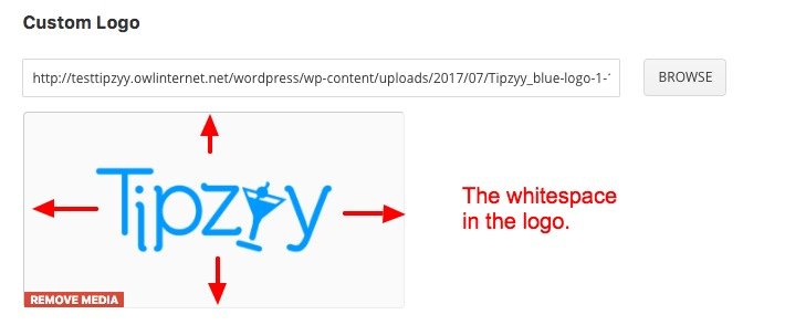
I’ve successfully changed the logo padding to 5px and it is working fine. Perhaps the effect you see has to do with your logo dimensions and the “white space” it has on the vertical edges. Have you tried uploading a logo with less blank space both on the top and bottom part of it?
Best,
Juan.Anirudh901 July 18, 2017 at 7:31 pmHi Juan,
I just checked the site and still don’t see any change, 🙁 the logo actually did not have any padding when I created the PNG.
I checked the site and it seems to keep getting reverted for some reason.
Thank you
Juanfra Aldasoro July 18, 2017 at 9:03 pmHi,
Thank you for the follow-up.
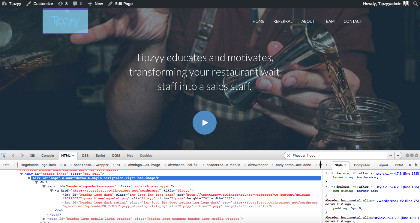
Are you sure you are currently checking the site you have sent me? I’ve just checked the site again and the logo padding value is set to 5px: https://cloudup.com/cYrM_m9iw6a
And the theme is showing 5px for the logo:

With regards to the logo whitespace, this is what I mean:

I would edit the logo and remove that white space from the image. Because as is, it actually shrinks a lot of white space and it is not clearly seen in the logo.
Best,
Juan.
You must be logged in to reply to this topic.

