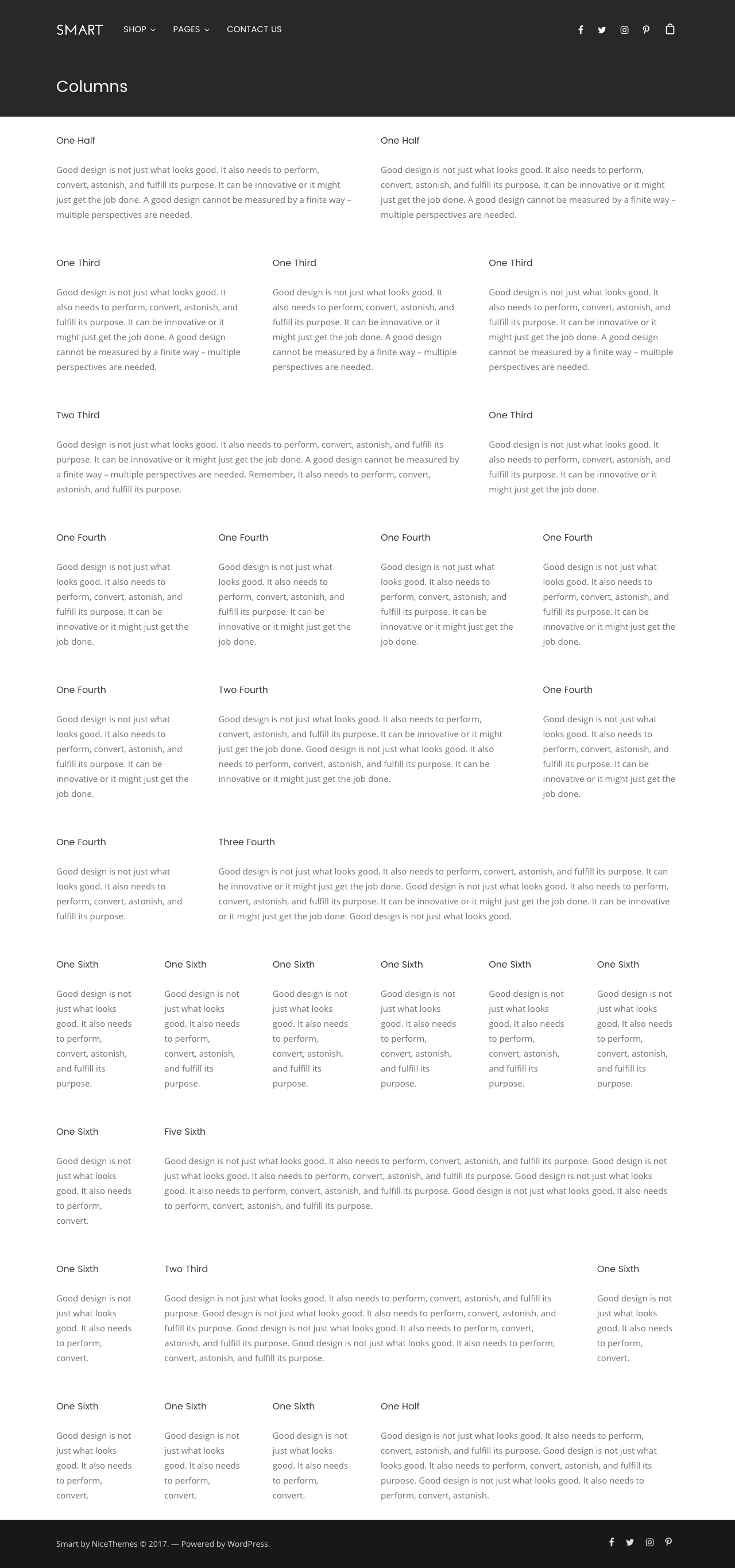
The grid system is based on the inherited Page Builder grid system. The benefits of this grid system are that it is advanced, responsive and fluid. It is really simple to use it and it is plenty of intuitive options for you to easily create any layout. The grid system is used to create different page layouts using a diverse amount of rows and columns to place your content.
So, how does it work?
- Rows: Rows are the primary containers. They are used to create horizontal groups of columns.
- Rows have a huge set of options to define its layout and style, and even the inner columns look.
- Columns: Content needs to be placed within columns. Only columns can be the immediate children of rows. But you can place inner rows inside of columns
- Columns can be of equal height, enabling you to create perfect blocks in a modernistic layout where colored columns match perfectly. You can change the number of columns you would like to have for each row. In Mobile device and Tablets views (unless specified by the responsive options) columns are stacked on one other.
Responsiveness:
The Grid System use the following breakpoints:
- Mobile: For small devices (phones), less than 569px
- Tablets: For medium devices (tablets), 570px to 959px
- Desktop: For desktop devices, 960px and up


