Menu Dropdown↑ Back to Top
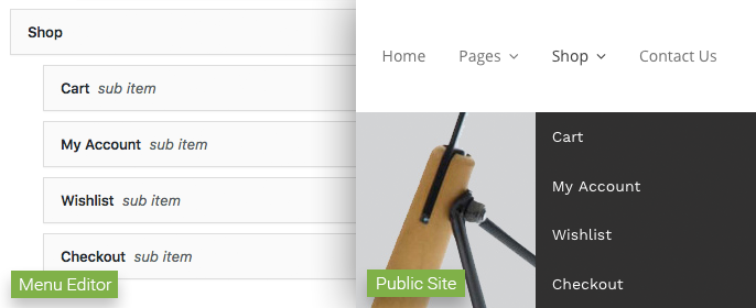
By default, Smart supports multi-level navigation through a menu dropdown. Links inside main menu elements that contain a submenu will display a down-arrow, indicating an additional navigation level. This level will be displayed when hovering the parent item.
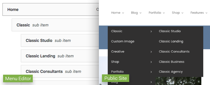
Additional navigation levels can be introduced by adding menu items as children inside a submenu. On the public-facing side of the site, the new level is indicated with a side-arrow, and will also be displayed when hovering the parent item.
If you need more information on how to manage WordPress menus, you can take a look at this article.
Labels↑ Back to Top
Four different labels can be used to highlight a navigation element. In order to use labels, you need to make sure the “CSS Classes” option is available for menu links. You can toggle this option in Screen Settings > Show advanced menu properties.
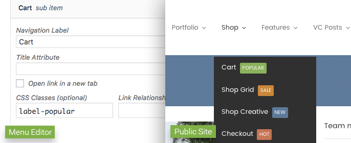
Now you can use the “New”, “Hot”, “Sale” and “Popular” labels by adding their CSS classes to the link’s settings box:
label-newwill display the “New” label.label-hotwill display the “Hot” label.label-salewill display the “Sale” label.label-popularwill display the “Popular” label.
Megamenu/Multi-Column↑ Back to Top
Smart also supports multi-column submenus, which we’ll also be referring to as “megamenus”.
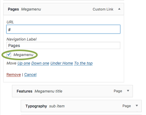
To have a megamenu inside your navigation area, you need to check the “Megamenu” box inside the settings section of the submenu’s parent element.
The number of columns is defined by the amount of direct children elements inside a megamenu. So if your megamenu has two direct children, it will have two columns; three children will generate three columns, and so on. We recommend having no more than four or five columns, so the megamenu columns don’t get too narrow. These direct children will be displayed in the Menu Editor as “Megamenu title”.
Children items of megamenu titles will appear under the titles themselves. Any possible children for these elements will be ignored, as dropdown menus are not supported inside megamenus.
Labels↑ Back to Top
Labels are also supported for megamenu links.
Embedded Images
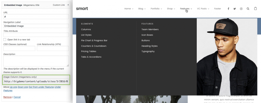
You can embed an image inside a megamenu column. To do that, you just need to set a new megamenu title (the direct child from a main navigation item marked as Megamenu) and add the URL of your image inside the “Image Column (megamenu only)” field.
Once you’ve done this, the image will be inserted inside the megamenu using the img tag.
Background Images
Background images for megamenu columns are also supported. To use this feature, you need to make sure both the “CSS Classes” and “Description” options are checked in Screen Settings > Show advanced menu properties.
To use a background image for a megamenu column, you need to add the background-image class to the megamenu title (the direct child from a main navigation item marked as Megamenu) of the column where you want the image to display. You also need to use the image’s URL as the only value for the “Description” setting.
Tip: If you don’t want to have a label for your item, just enter “ ” in the “Navigation Label” field.
You can also adjust the position of the image inside its container with more precision by adding any of the following classes to background-image:
background-top-leftbackground-top-rightbackground-top-centerbackground-bottom-leftbackground-bottom-rightbackground-borrom-centerbackground-center
Additionally, the size of the background image can be adjusted using these classes:
background-coverbackground-contain


